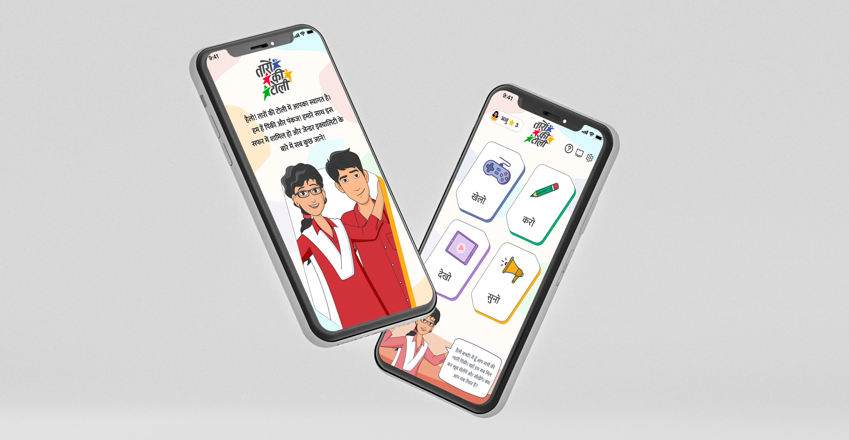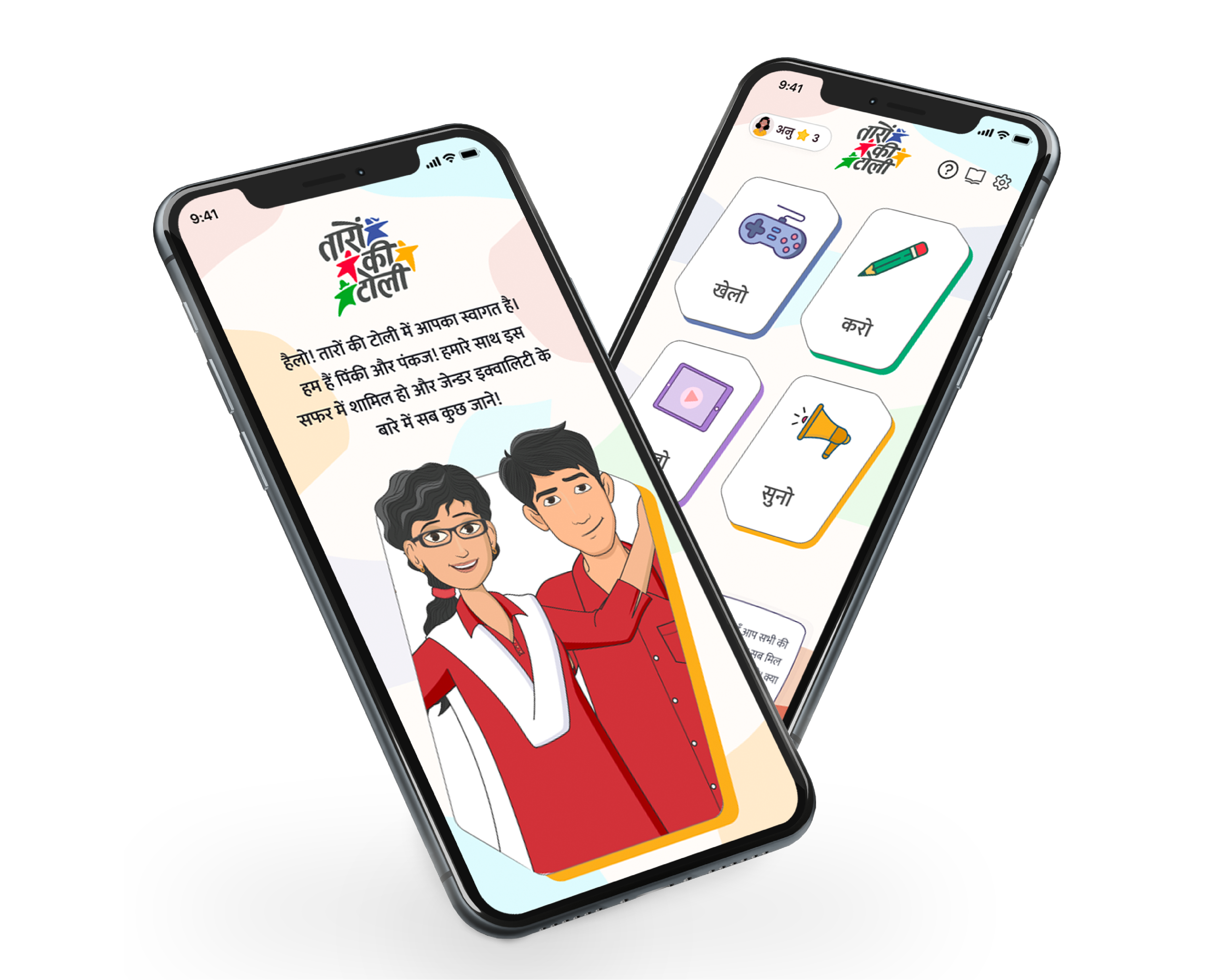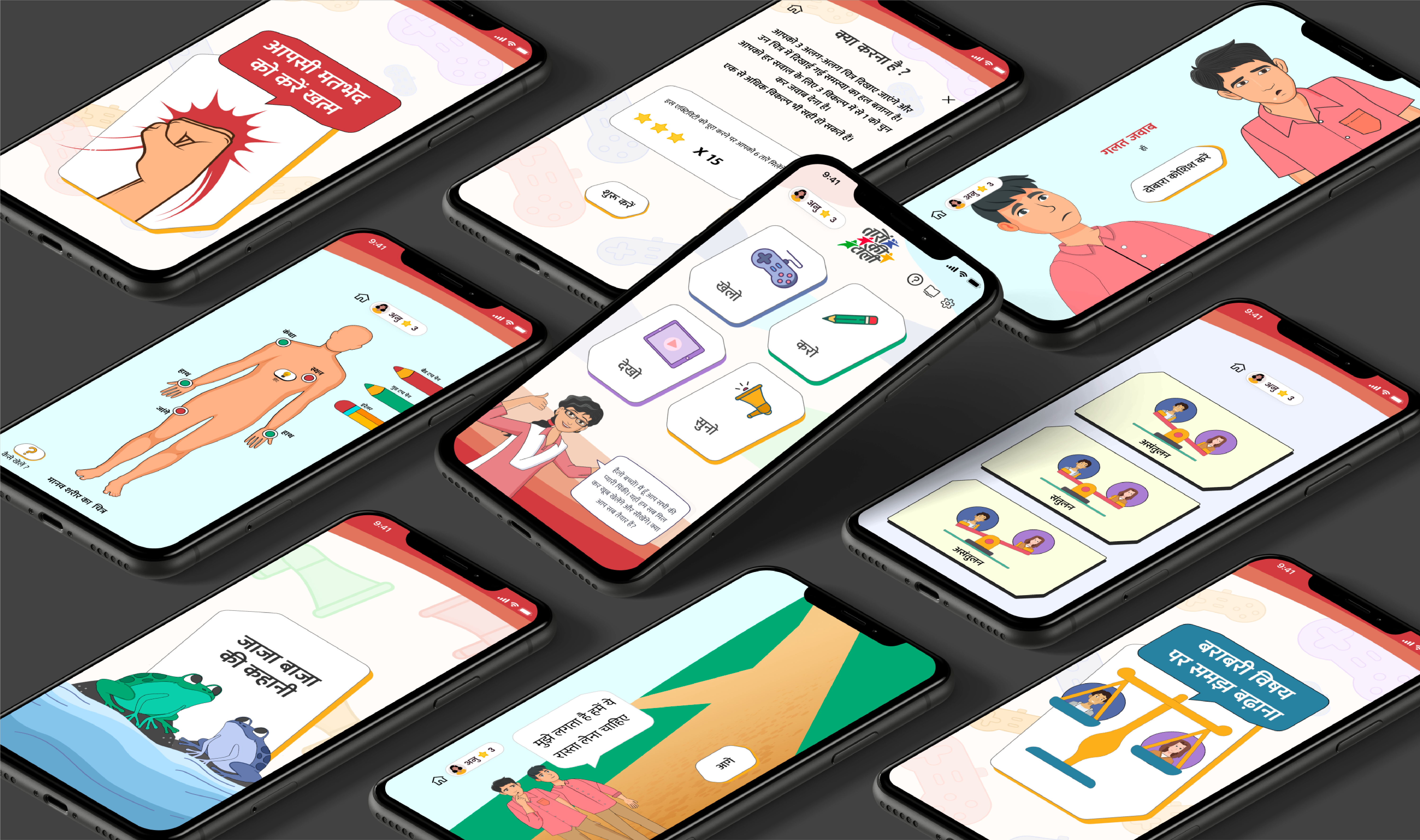
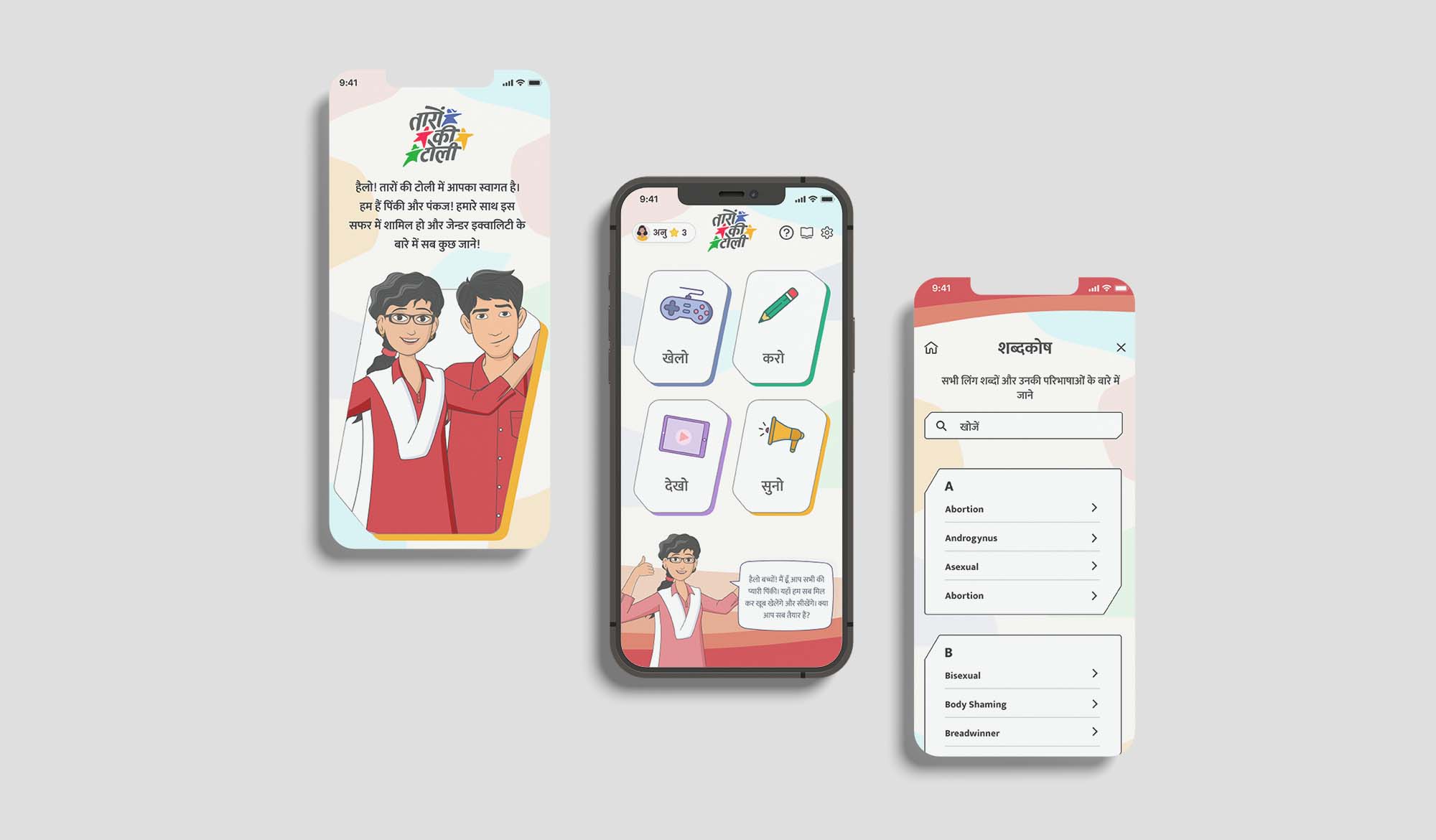
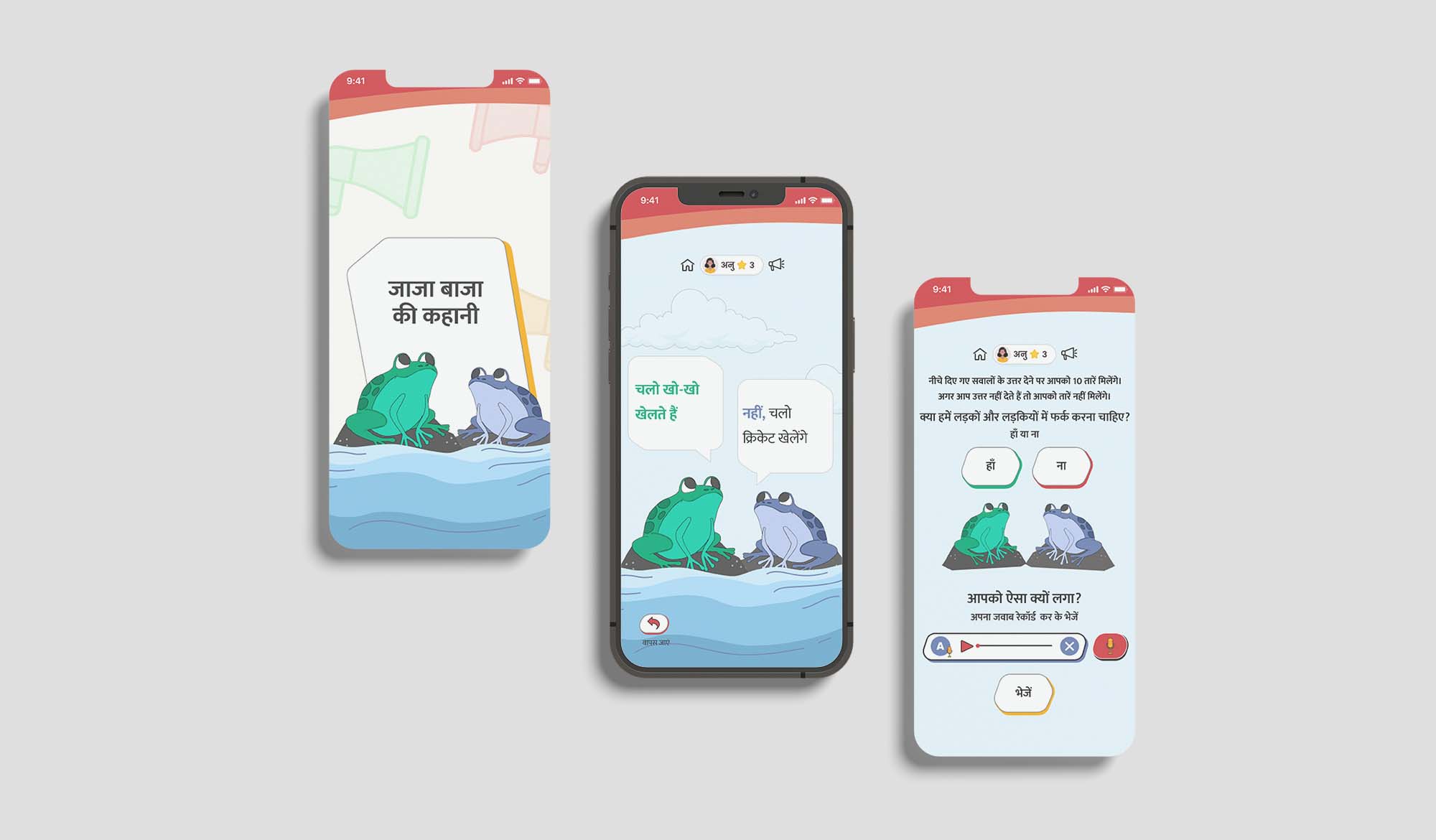
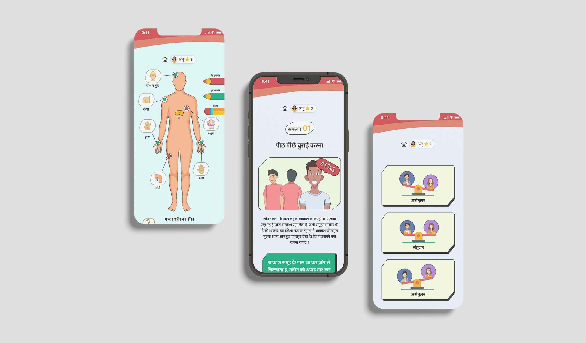
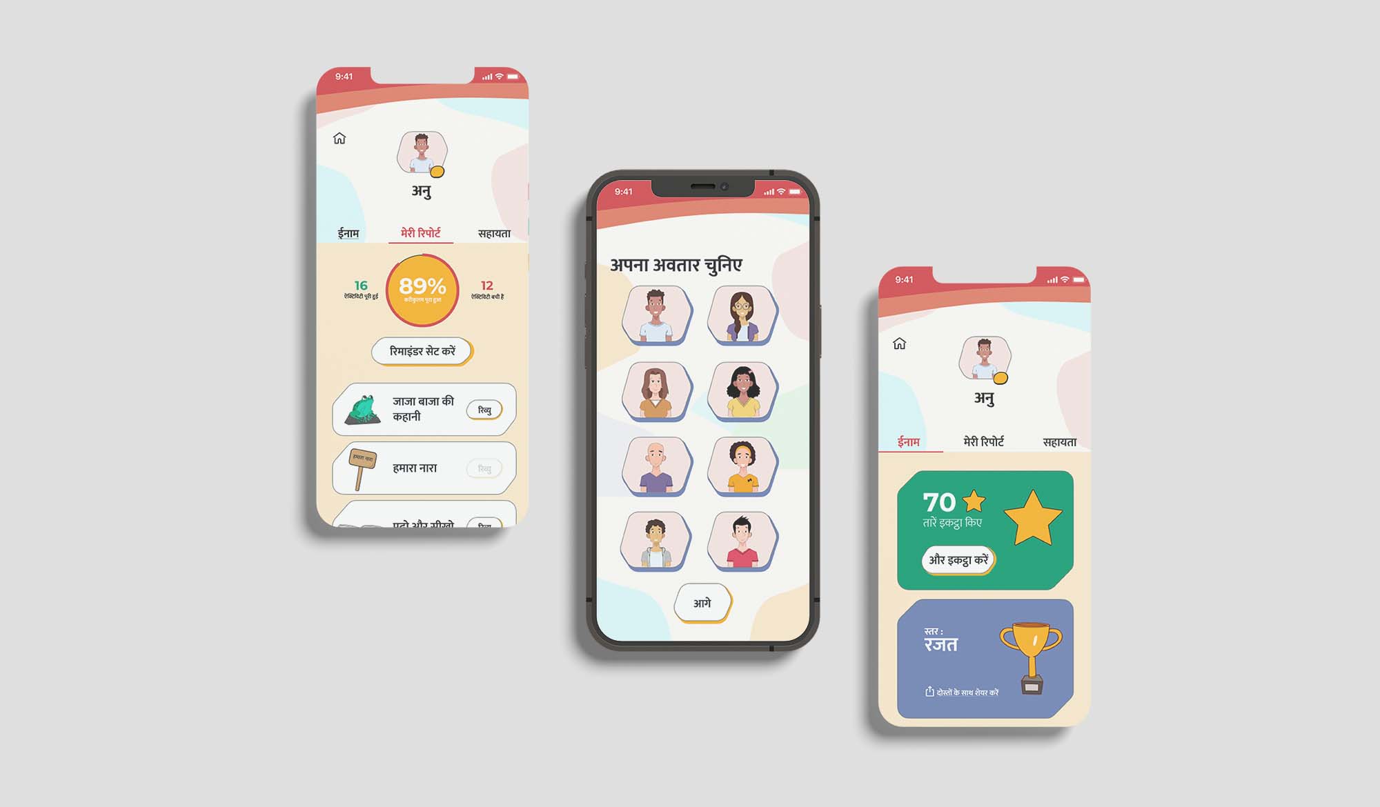
The idea of the app was to make learning fun for children. The problem statement from the beginning of the project was ‘How do we teach children about Gender Discrimination and Gender roles through a playful and gamified experience?’ The application features multiple mini games and activities which a student can experience and gain stars doing it. The games range from simple quizzes to voice based games. The activities are mainly divided in 4 categories: Play (Khelo), Watch (Dekho), Do (Karo) and Listen (Suno). These different categories help in bringing different aspects of playfulness in the application.
Target Audience
Children aged: 9-15
Client
Kaboom
The Challenges
– Communicating Breakthrough India’s brand identity and ideals through the design
– Creating an interactive, Interesting app that would stand out among competitors
– To design a playful application that will be used by students across different sections of the society
– Researching the pain points faced by users when interacting with education applications
– Understanding app-specific flows and interactions to present relevant information appropriately on the app-screens.
– Ensure it was responsive across all mobile devices.
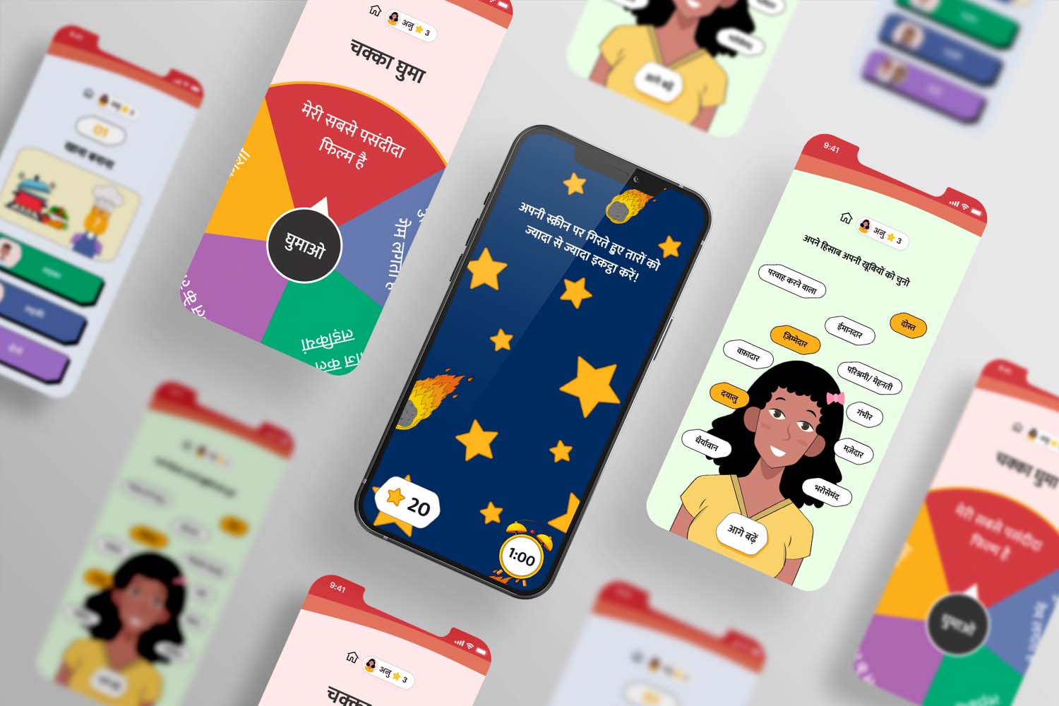
Local Language
The application was designed in Hindi keeping in mind that a vast majority of students, especially in the rural areas can’t speak or understand English.
Activities
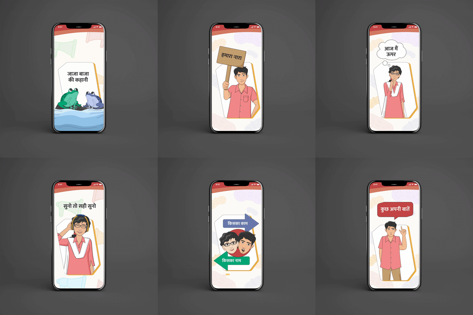
The app was functional without compromising on a modern and attractive touch. Instead of creating something generic for students, Studio Mesmer designed an interactive experience using illustrations, micro-interactions and gamification to make the experience of the children enjoyable.
Studio Mesmer started by understanding the processes needed for a Educational app. In order to create a memorable user experience, we went back to the basics and rebuilt the foundations of the product. Our main colour palette relied heavily on the contrast between bright, Vibrant and Neutral ones. We defined specific color used for highlights and calls to action. For the backgrounds, We used lighter versions of the main ones.
